San Diego Traffic Collision Analysis
Project submitted to UCSD Datathon 2019 by Nathan Tsai, Bernard Wong, and Sally Poon.
Winner of “Overall Best Project” Challenge by Lyft.
Introduction
Traffic is an incredibly large issue in California. According to a 2015 U.S. census1, four of the top ten worst locations for commute (based on commute time) are located in California, which can lead to a plethora of other problems. As technology becomes more and more advanced and we have access to more and more data, opportunities arise for data-related problem solving, and the issue of traffic and collisions is no different.
With access to data regarding both traffic and collisions, we have a lot of power to help answer some questions that we may have. However, we needed to have a general understanding of what all the data is and what it actually represents. Our first steps involved the translation of the data into visuals so that we can identify general trends and ideas that help us both answer and formulate more questions.
General patterns of traffic
As most of us have experienced, San Diego has its fair share of bad traffic. As a big overview, we decided to first look at the traffic trends of San Diego over time. We utilized an additional GeoDataFrame of roads that we downloaded and merged it with the traffic dataset and then organized it by date.
Afterwards, we created an animation of maps over time that would help give us a general idea of the trends of traffic. The general trend as time passes is that traffic becomes more and more abundant; we start to notice more and more roads with traffic. We also noticed a few sudden spurts of days where there is a lot of traffic covering all of California. This makes sense, as traffic tends to create more traffic, and because there are many areas with traffic during those days, there’s a high chance that the traffic has an exponential effect of leading to more traffic.
However, this leads to more questions. There are random spurts of days where there will be loads of traffic spread across all of California, and there are certain areas where there are lots of traffic. Why is this? What are the days that have those spurts? With this new development of questions, we continue to explore.
What’s the relationship between traffic and time?
After finding the random spurts of traffic activity in the geographical data, we wanted to find out if there was a correlation between the day of the week and the amount of traffic. So using this data set, we plotted a histogram of the average amount of cars per day of the week to see if the day of the week was a deciding factor towards why there traffic was present.
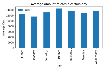
Figure 1. Average Amount of Cars per Weekday.
To test if the day of the week correlated with the GeoDataFrame, we looked at a random datetime point when there was a lot of traffic and converted it to day of the week. We then compared it to our data and saw there was a correlation between day of the week and traffic.
After this we wanted to see if collisions relate to the amount of traffic in the day of the week. We tried to find the probability of getting injured and killed due to collisions on each day to see what day was the most dangerous. We combined the total injuries and deaths of each day of the week and divided it by the total injuries and deaths of the dataset as a whole, to see the likelihood of getting injured or killed on that day.
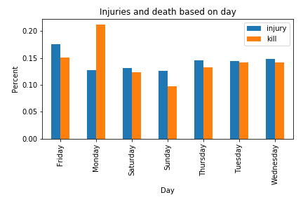
Figure 2. Injuries and Deaths per Weekday.
Using this data, we found out that Friday had the most injuries while Monday had the most deaths. This could be because Friday is when most people would start going out to drink and Monday is when people may be more exhausted from just coming back from the weekend.
After analyzing both the average cars per day and the probability of getting injured or killed on each day, we decided to see if there was any correlation. To our surprise, we saw a correlation of -0.216 between cars per day and injuries and a correlation of -0.904 between cars per day and deaths. This means that when there are less cars, there are less injuries and deaths. However, because correlation is linear, this doesn’t completely mean that there is no relation between cars per day and injuries and deaths, and therefore we should take this value with a grain of salt.
What’s the relationship between area and travel related injuries?
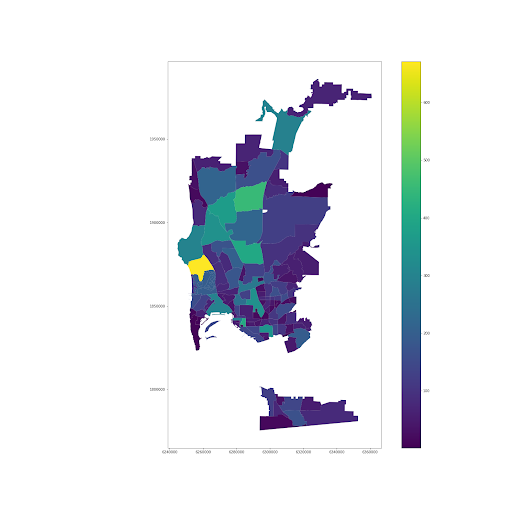
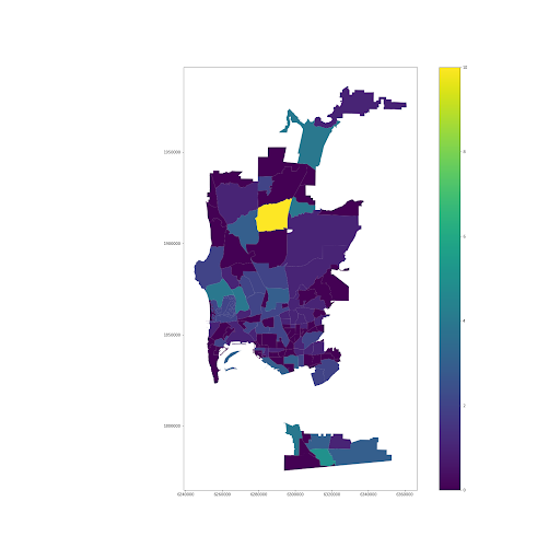
As noted from our previous analysis, we’re noticing general trends with time and patterns with travel related injuries. As a result, we decided to look into another factor that might affect injuries which were ‘beats’ or cities. Using an additional GeoDataFrame of beats and our collisions dataset, we were able to map different cities and the number of injuries and deaths that occurred in each region.
| Injuries per Beat | Deaths per Beat |
|---|---|
|
|
Figure 3. Injuries vs Deaths per Beat.
Some interesting things instantly pop out. There are outliers for both maps, and upon further dataframe manipulation, we discover which ones these are. Pacific Beach is the area that has the most injuries of 671 (the second is Mira Mesa which has 452). Mira Mesa is the area that has the most killed of 10 (the second is San Ysidro which has 5). These are incredibly huge jumps between first and second!
We believe that Pacific Beach could possibly have the most injuries because it’s a big ‘pub location’ and also near Downtown San Diego. Injuries don’t necessarily involve only cars, and could involve pedestrians being hit or other car interactions. This could possibly be the reason why that area specifically is such an outlier. Mira Mesa is a little more difficult to hypothesize, but a possibility could be the fact there are more highways that pass through (since highway crashes are the ones that tend to lead to more casualties). A quick Google search potentially supports idea; I-15, a major interstate that passes through Mira Mesa, has been named as one of the deadliest roads in the US according to Scripps Howard News2. Further analysis is definitely needed though, since the highway definitely passes through other areas.
At this point, we’ve noticed that there are a lot of outliers within the data that demonstrate a scary story. Should you never drive on Monday or Friday? Should you just never visit Mira Mesa or Pacific Beach? This leads us to our ultimate analysis and hypothesis test, where we chose to focus on whether the danger of Pacific Beach is truly worth concern.
Pacific Beach Collision Case Study
From the visualization generated through the choropleth graphs and other plots, we saw that there was an extremely high number of collisions in one particular beat: beat 122.

Figure 4. Collisions in each Police Beat.
Looking at the 10 beats with the most collisions below, we see that Beat 122 has significantly more collisions than the 9 other beats.
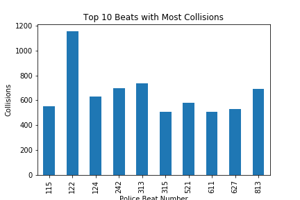
Figure 5. Top 10 Beats with Most Collisions.
From the choropleth, we determined that Beat 122 was Pacific Beach, which had the most collisions of all the beats in the dataset. We thought that beat 122, which had the highest number of collisions, would have a higher average of combined injuries and deaths.
Question
Due to having the highest number of collisions, does Pacific Beach (Beat 122) have a significantly higher average of combined injuries and deaths than other beats, which do not have as many collisions?
Null Hypothesis
Collisions in Pacific Beach (Beat 122) will not have a significantly higher average of combined injuries and deaths than the average combined injuries and deaths of collisions in the other beats of San Diego.
Alternative Hypothesis
Collisions in Pacific Beach (Beat 122) have higher averages of combined injuries and deaths than collisions in other beats of San Diego.
The statistic we are looking at is the average of the sum of the number of injured and killed for each collision, which we will define as ‘average hurt’. The observed average hurt in Pacific Beach (Beat 122) was about 0.584416 people hurt each collision.
We then took the average hurt of 50,000 samples of the clean collision dataset, each of size 1,155, the amount of collisions in Pacific Beach (Beat 122), in order to see if the average hurt in Pacific Beach (Beat 122) was significantly higher than the average hurt of a random sample of collisions of the same size.
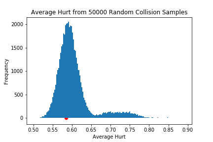
Figure 6. Average Hurt from 50,000 Random Collision Samples.
In the graph above, the red dot represents the observed average hurt in Pacific Beach (Beat 122) and the blue histogram represents the average hurt values of the 50,000 random samples of the collision dataset. We can see that the observed average hurt value is right in the middle of the unimodal histogram’s large peak. Calculating a p-value of 0.65148 further confirms that our observed average hurt in Pacific Beach (Beat 122) is not significantly higher, like we hypothesized.
Therefore, we accept the null hypothesis that the average of combined injuries and deaths in Pacific Beach (Beat 122) is not significantly higher than the average combined injuries and deaths of collisions in the other beats of San Diego. From this conclusion, it would be reasonable to think that a high amount of collisions does not necessarily mean that more people will be injured or killed on average.
Conclusions and Insights
Based on our hypothesis test, we can conclude that just because an area has the most collisions, it doesn’t necessarily mean that area is specifically dangerous, in terms of collision-related deaths and injuries. But our analysis and hypothesis test still leaves some questions unanswered, and even leads to other questions. Are there any reasons why those days specifically are an issue? Why are areas around Pacific Beach not as prone to injuries like we’d think? How come other areas around I-15 or Mira Mesa don’t have nearly as many casualties? There are still many different questions that can be explored.
There were also many issues with the data that would ideally get resolved if we had the opportunity to analyze this data in the future. There were multiple areas in the different data sets, such as missing data, rounded off data (times and dates being rounded), and a variety of other messy data inputs. While we considered these different things and in general these were relatively negligible (due to our large dataset), it would be interesting to determine why these certain areas or data points were missing. We also felt that the traffic data didn’t provide enough data regarding each of the roads, as it would only have data on a few roads for each day (most likely due to a specific definition of traffic or a specific threshold of number of cars). If data could be collected on the total number of cars on each road per day, this could significantly help the traffic collision analysis.
Given our identification of the most impacted traffic regions in San Diego through looking at traffic collision data over the past 4 years, we can suggest drivers and businesses optimize their routes to avoid these areas and roads with around 50% more collisions for safer and more efficient commutes.
Overall, while we’ve taken a large step in analyzing this data, there’s still much to explore. Traffic will always be a large part of transportation, but with the strength of Data Science, large strides can be made to make traffic a thing of the past.
References
- USA Today. 2015. “10 Cities with the Worst Traffic”.
- CBS News. 2010. “America’s Deadliest Roads”.